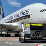
From helping reduce the likelihood of a bird strike to making sure the airline brand is recognisable, aircraft livery design is a complex process.
Edmond Huot, the chief creative officer and founding partner at Forward Studio, a multidisciplinary New York City–based airline branding and livery design company, leads a specialised practice area in the airline branding and public relations space.
The firm’s clients have included Northern Pacific Airways, UATP (Universal Air Transport Partners), Experian, FLYCOIN, Tailwind Air, Hawaii Island Air, Wasaya Airways, InterCaribbean Airways, and Frontiers
North Adventures.
Huot spoke to FINN about the work his studio undertakes – and how safety defines everything they do.
What are the key considerations when designing a brand new airline livery?
I believe that there are several principles or factors that contribute to the general success of a livery scheme. The specific colour selection as well as design application of any and all chosen colours must work to complement the lines and dimensional form of an aircraft type. An airline’s desire to maximise marketing visibility often influences its respective livery design choices.
For example, this approach has given rise to a very common tactic where the airline’s logotype or letterforms are exceptionally large on the side of the aircraft in order to ensure the plane can be seen from a distance on the ground or in the sky. In some applications, this design decision works, while in others it appears rather heavy-handed and garish. Also, certain colours—such as yellow, pink, or brown—don’t translate or “read” very well at scale in application.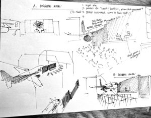
Certain colours do not easily lend themselves to promoting the sleek and contoured lines of the aircraft. I suspect an airline like Spirit intentionally painted their planes in bright yellow with oversized black lettering on the sides of the planes in order to stand out, helping to reinforce a bold brand position in the market that playfully suggests flying is as easy and inexpensive as taking a cab!
In the case of Northern Pacific Airways, the use of classic colours such as black and white presents a rather timeless/classic combination (vs. trendy colours or shades that go in and out of fashion).
Of course, beyond my artistic impressions, another important consideration is the client I am working with. Much time and effort goes into understanding their business; including the type of airline they are (e.g., mainline, low-cost, ultra-low-cost). In-depth research on the graphic elements and motifs used in the airline’s design vocabulary plays an important role in the final design application and expression of the livery, since this mark will be interpreted from a range of cultural perspectives where meaning and context vary from one country or city pair to another.
What is the difference in terms of weight between the most simple and elaborate designs, and must you be mindful of this during the design process?
One of my learnings in this business has been to respect and show consideration for how and why aerospace coating is an important consideration. While I am often leading the creative side of the livery design, the actual selection and application of specific paint grades and hues must be taken into account.
It seems there are two camps when it comes to colour and design. Some airlines, like Etihad and Southwest, opt for more elaborate and comprehensive schemes as a way to stand apart from the more conventional players. Conversely, many (more) airlines today are opting for what the market calls “Eurowhite” schemes, where most of the fuselage or body of the plane is painted white while the back end and tail are used to showcase colour and design.
 Furthermore, the airline’s lettering is typically located at the front in an oversized application. While this design approach reads as more simple, it also satisfies the marketing and promotional interests of the airline (i.e., the plane’s marketing can be seen and read from a distance on the tarmac or in the sky). Additionally, designs that call for more coverage require more paint which adds weight to the aircraft. Also a plane designed with full coverage of colour faces possible cost and logistical issues down the road if and when a certain section or piece of the fuselage needs to be replaced.
Some of the more practical reasons for painting a plane white include the following:
-Heat abatement: white deflects the heat from the sun, helping to keep the exterior and interior of the aircraft from overheating.
-Detection of damage: white allows operators to better see/detect corrosion and dents as well as fuel and hydraulic leaks.
-Bird strike deterrent: a surprisingly common problem today involves flocks of birds that fly around busy airports. Birds have a harder time distinguishing an airplane when it’s painted in a darker colour.
-Less likely to fade: white—unlike darker colours—doesn’t fade as quickly, making it an efficient colour choice.
What are the main challenges for you as a designer during the initial design phase of an aircraft project?
Ultimately, my main challenge with these projects concerns timing and speed. Most often the livery design is but one of many design applications that are born out of a much greater creative and strategic branding exercise. Since the aircraft and its respective livery design are one of the most high-profile touchpoints seen by many, I must work quickly to get to the point where we are able to present the new or updated brand to the client.
From the time we get the green light to proceed, my team must move quickly to conduct, review, and interpret a great deal of research and strategy on both the airline’s goals as well as its respective markets and audiences. A staged process ensues where key learnings are then translated into expressive and imaginative mood boards which use storytelling and thematic narrative to bring data points and certain key drivers to life.
 Graphic motifs and colour palettes must reflect both the geographical and cultural hot points of the audiences who will eventually interact with the brand. From there, I work quickly to explore and apply countless design approaches to a wide range of customer journey touchpoints—from pre-departure, and departure, to inflight and post-arrival. These often include applying the finished mock design to the website, signage, uniforms, advertising, cabin interior, and, of course, exterior design. I invest considerable resources into making sure the first time the client sees the livery it looks as real and alive as possible. My mantra is, “No Vision – No Decision!”
It is crucial that the leadership team on the client side loves what they see on the first viewing since every time we have to go back and rethink ideas we lose critical momentum and confidence. This is why getting the strategy, brief, and brand story right matters so much since it must help support and reinforce the more subjective side of seeing and liking the livery in the first presentation.
From an operational perspective, are there any strict dos and don’ts that you must adhere to?
Operationally, it’s important to respect a multitude of considerations ranging from which parts of the plane can be touched by your design to what colours should and can be used. For example, the wings and certain parts of the tail cannot be painted as doing so would affect its weight and aerodynamic flow. If the letters of the airline’s name are too small and intersect the windows, they become less readable, which is why, in part, we see such large, oversized lettering.
Typographically, it is more common to see sans serif typefaces being used as well, which improves legibility. I always focus on the aircraft types specifically when it comes to the initial conception of lines and graphics in relation to the aircraft’s body and tail.
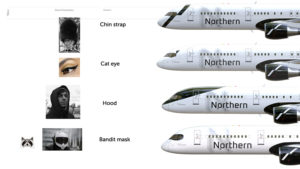 Understanding the unique concave surface of the plane allows for respecting how graphics and lettering will best read when angled and distorted. Also it helps to be a bit of an AvGeek since each aircraft type has its own distinctive design features which should be played up with respective design solutions. For example, with Northern Pacific Airways I wanted to modernise their Boeing 757-200’s front cockpit windshield with a somewhat cheeky ‘racoon mask’ paint application.
It was my way of enhancing the notably large and graceful front nose section of that aircraft type with something eye catching and memorable, I also consider the underbelly of the aircraft as a placement opportunity for the airline’s logotype, since we know that many people who watch a plane on approach or on take-off will see—and appreciate—this rather surprising statement.
In terms of the wider livery design industry, are there many competitors, and how is your approach different to others?
The business of designing liveries really falls into three camps. First, there are the large, multinational design practices (often owned by global holding companies), which tend to serve the needs of the mainline and legacy carriers (i.e., Delta or American).
These companies are retained based on a broader function relating to overall advertising, media spend, and PR. At the other end of the spectrum we have small charter airlines and aviation operators, which tend to wear many hats out of necessity, often working directly with local design shops or freelancers. In some cases they might even do the design themselves! Often we see MROs (maintenance repair operations) and aerospace paint shops that will provide livery designs as an overall function of their painting/maintenance contracts.
Our firm, Forward Studio, sits more in the middle, as a specialised boutique shop focusing on livery design as well as overall brand expression. Based in New York City, we offer a mix of consultative planning with an agile, cost-effective design approach. I often work with the airline owners and their investors directly, which appeals to their desire to move quickly with hands-on oversight.
We’re able to scale our approach according to the unique requirements and mandates of our clients. This can be seen as a value-add since smaller and midsize airline start-ups typically face a myriad of hurdles and time-sensitive challenges. My job is as much about design as it is about responsive and unconventional problem solving!
 For me, exceptional liveries extend beyond the commodified design and production of applied graphics. They represent the embodiment of the airline’s overall brand story, which ties into travellers’ deeper aspirations and desires. This approach goes beyond the rather uninspired Eurowhite trend of today by offering design twists that catch your eye or make you smile or nod while thinking, “Now that’s smart!”
Take Virgin’s illustrative Flying Lady icon (which has recently been modified to reflect more inclusive gender-neutral depictions). This is a good example of how the brand statement and livery design work together to tap into deeper, more emotive storytelling. Air Canada’s recent livery update challenges traditional positioning and placement of its maple leaf picture mark by intentionally relegating it directly below its respective word mark. This creates a subtle design tension that actually modernises the overall scheme.
SAS’s most recent update to their airline livery includes a rather understated, yet eye-catching, metallic sheen paint effect that’s applied to the airline’s oversized letterforms—a design decision that challenges the more typical and rather one dimensional lettering style that uses bold overt colour.
Airlines of the past, like Braniff, Northwest Orient, and CP-Air, are great examples that I look to as inspiration when it comes to how design can better tap into the art and humanity of flying. I often reference these examples with my clients in an effort to help elevate both the discussion and ultimately the livery solutions themselves.
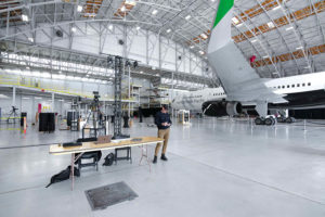
Photo credit: Forward Studio
Subscribe to the FINN weekly newsletter